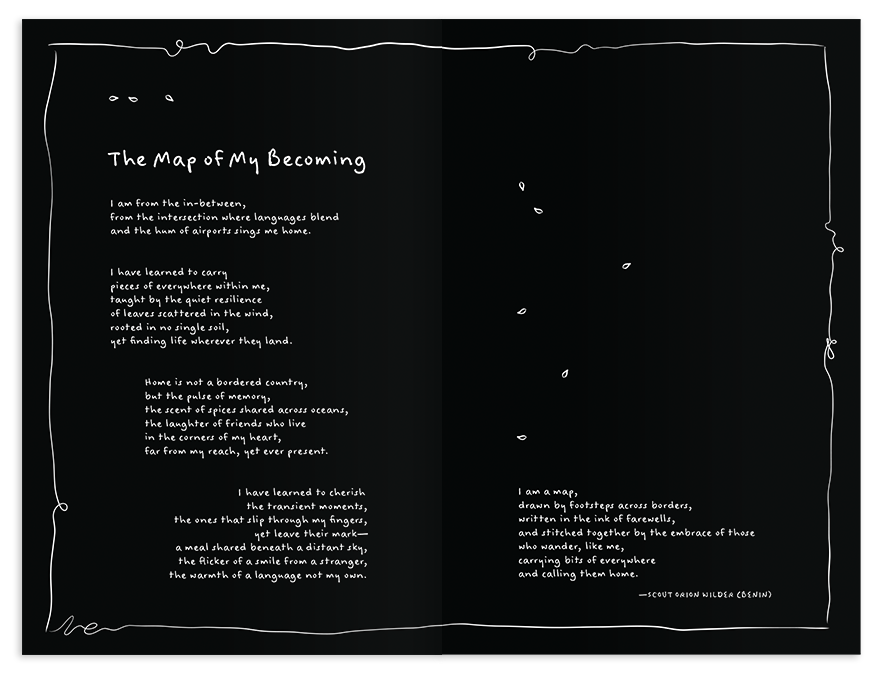
Getting the opportunity to bring Michèle's incredible manuscript to life was the honour of a lifetime. Her book reflects that of a three-act play, including interludes, poems, and quotes. The variety in interior content presented unique design opportunities to mix typefaces and use different layouts for separate sections, breaking up heavier texts and allowing for breathing room throughout.
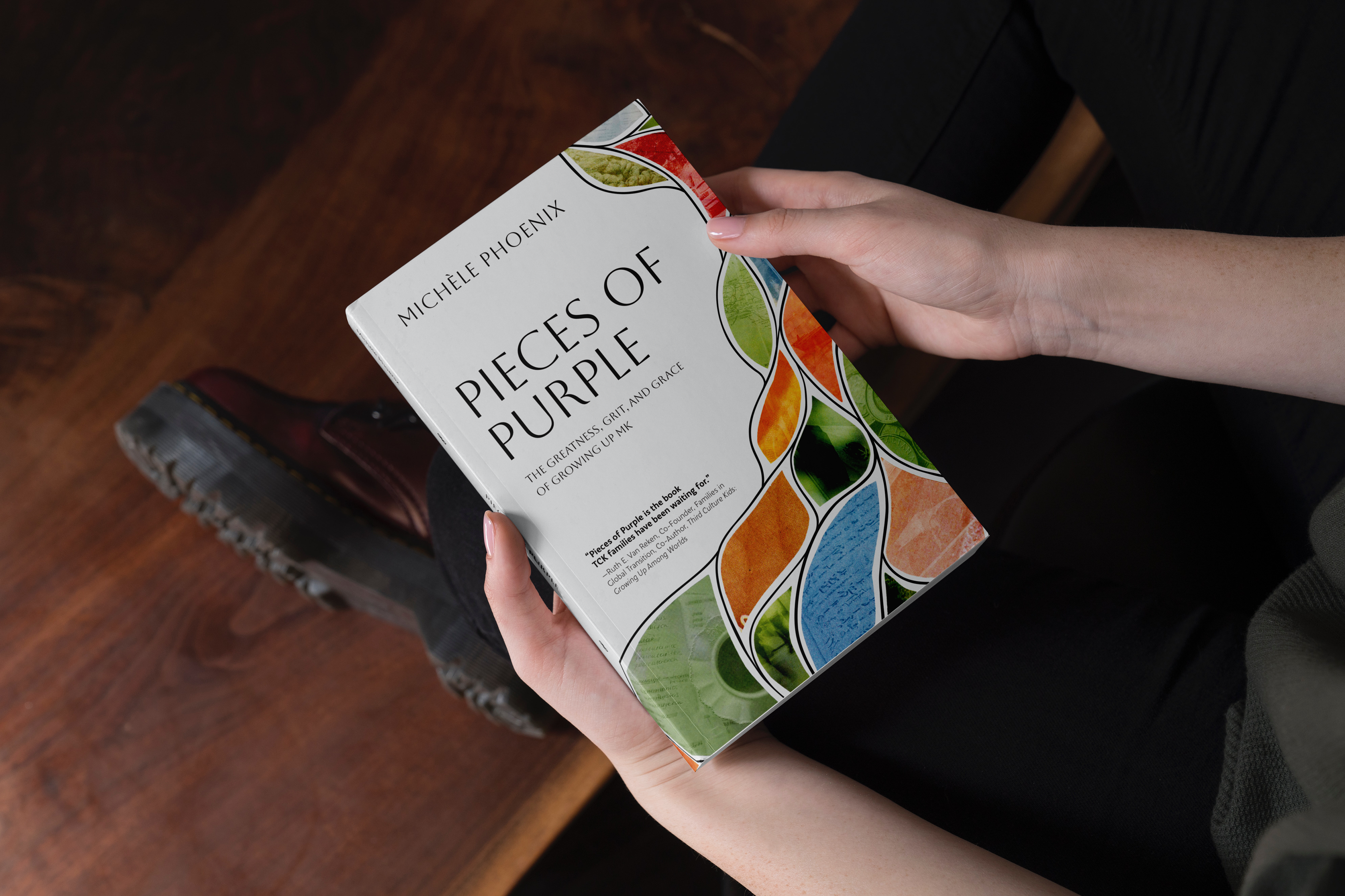
The motif of a leaf acts as a throughline in this design, finding initial life on the cover in multi-media collage. Collage felt right for a book about childhood "pieces." Michèle and I decided to avoid the colour purple to drive home this point: the true essence of "purple" in a TCK context is less about looking a specific way and much more about deeper mixing, flow, and movement - all themes embedded in the cover graphic and carried throughout the book.
Christianity Today's Missions and the Global Church 2025 Book of the Year Winner